Northvale Architects
An architecture studio brand site — editorial layout, CMS project index, and Webflow build from first frame through publish.
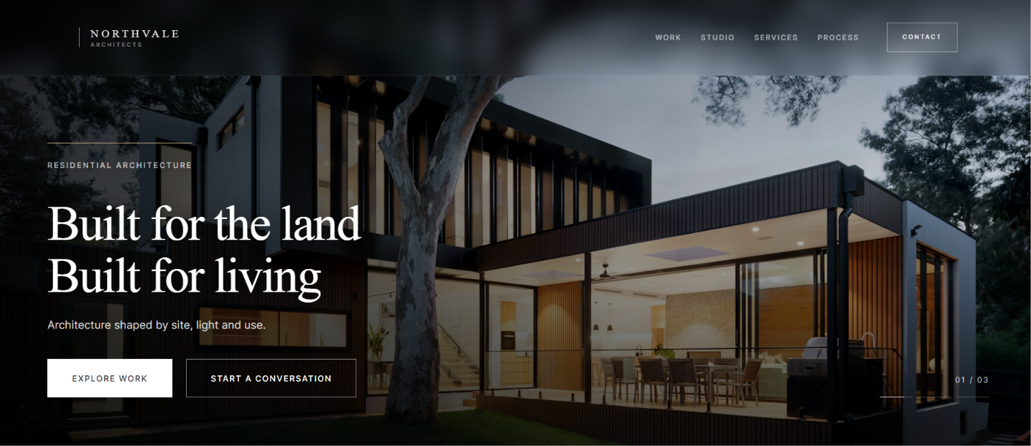
An architecture studio site that leads with work — built with editorial discipline and CMS-ready structure.
Northvale Architects is a portfolio case study for a fictional studio — built to test a full brand narrative: positioning, editorial layout, Webflow architecture, and motion in one coherent build.
The brief was self-imposed: a studio site strong enough for a portfolio review. Light editorial UI, restrained type, systematic components, motion that guides — not decorates.
Designed in Figma. Built in Webflow with Client-First and Variables. Animated with GSAP. The site shows editorial process and build quality — not fabricated studio history.
Most architecture studio sites look identical — full-bleed hero, minimal copy, project grid. The challenge was building something that felt as intentional as the work it represents.
Earn credibility through editorial rhythm — not through louder visuals.
Portfolio vs. presence
Architecture studios compete on taste and restraint. The site had to feel editorial and confident — not like a generic agency template with swapped photography.
Depth without noise
Project pages need depth without becoming brochures. The challenge was building a CMS structure flexible enough for case studies while keeping the index scannable.
The brief was to make a studio site that reads like a considered publication — not a slide deck of renders.
A small studio site still needs the discipline of a larger build — clear structure, repeatable sections, and copy that earns trust without overselling.
Lead with the work, frame the studio, then make contact feel inevitable.
Discover
Reviewed architecture studio references and mapped what felt credible versus template. Tagged patterns to borrow — project rhythm, editorial type, calm whitespace.
Define
Established typography, spacing tokens, and component logic before page layouts. Named classes early so every section inherited the same visual grammar.
Design & build
Built the CMS project template, variables, and page structure in parallel — not as a polish pass at the end. Home, work, and contact were designed as one narrative arc.
Refine
Iterated motion, hover states, and copy until the site felt finished — not just populated. Every animation had to clarify hierarchy, not decorate it.
Design lens
Light editorial surfaces that let project photography lead
Typographic hierarchy calibrated for long-form studio copy
Restraint over trend — credibility before decoration
Build lens
Client-First structure with CMS-ready project templates
Responsive Webflow build with editorial layout and native interactions
GSAP scroll reveals with reduced-motion fallbacks
The process was the product — the site had
to prove systematic thinking, not just taste.
The interface had to feel finished before every image was final — hierarchy, spacing, and contrast doing the persuasive work.
Dark-first UI that earns trustthrough restraint, not decoration.
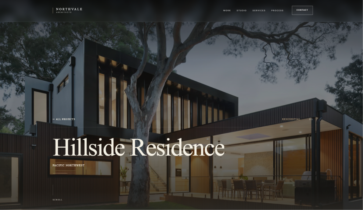
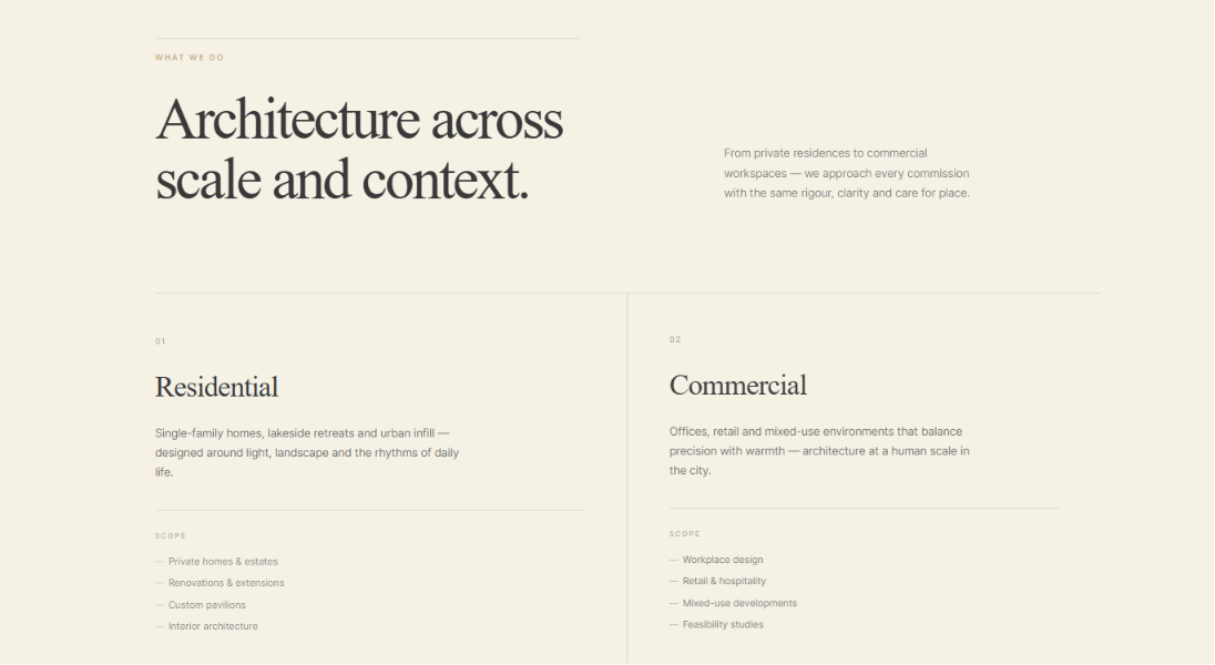
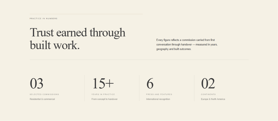

Concept interface moments — built to demonstrate discipline, not shipped product screenshots.
Every meaningful choice carried a trade-off. These are the decisions that shaped the system — not the defaults the category would have handed us.
Editorial restraint at the system level beats decoration at the component level.
Light editorial UI
Light canvas, deep type, photography as the primary interface element.
Dark portfolio tropes can feel premium but also interchangeable. Northvale needed calm credibility — a surface that lets projects and typography do the persuasion.
Typography as structure
Serif headlines, sans UI, strict type scale with no arbitrary sizes.
Studio visitors scan before they read. With project metadata throughout, the rhythm of headlines and labels had to carry meaning from day one.
Client-First architecture
Global classes, variable-driven spacing, CMS-ready project templates.
A studio site still has to prove the build scales. The reusable case study template is part of the argument — not an afterthought.
What we chose
What we avoided
The best portfolio work doesn't pretend to be a case study with metrics.
It shows the thinking, the system, and the finish.
A studio portfolio has no client ROI to report. What it can prove is process — and whether the work holds up as a portfolio argument.
Proof of editorial discipline, not proof of awards.
End-to-end build
From brand surface to CMS template — every layer was designed, built, and structured as one coherent studio argument.
Reusable system
The case study template is not a one-off page. It is a scalable CMS structure any future project can inherit.
Honest positioning
No inflated metrics, no fake testimonials. The work speaks through structure, typography, and finish.
This project shows how I think about studio sites — editorial first, systematic underneath, finished through publish.
You've read one chapter. The other published case studies — concept and client builds — live in the archive.
Keep exploring the work.
01 · Published
02+ · In build
Archive · Always open
When the next case publishes, it lands here first.
Until then — the full index holds every project.
If this case study read like the kind of process your next build needs — the conversation starts here.
Open to serious Webflow projects.Built on clear goals and shared direction
Based in Belgrade · Working remotely worldwide.